Version Legato 1.1n (GoFiler 4.24a) introduced trackbar support. This is a Windows common control allowing for the adjustment of a visual slider. Trackbars are commonly employed to allow users to adjust things that have a range of values, such as the magnification of a document or image, the position inside a document, or the volume of the playback on an audio/video file. Trackbars are similar in many ways to scrollbar controls.
Friday, October 05. 2018
LDC #105: Dialog Boxes Part VI — Trackbar Control
Introduction to the Control
A Trackbar Control (Windows SDK control class name ‘msctls_trackbar32’) is a window that renders a tracking bar with scrollbar like functionality. Operation and appearance are similar to a scrollbar control except the the trackbar has a slider (as opposed to a thumb track) and no end arrows.
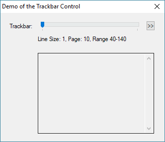
An example:

The slider can be moved by the mouse or keyboard, and movement results in notification messages.
Control components include the channel, slider, select area, optional buddy windows, and an optional tooltip. The control can be set up with a vertical or horizontal orientation with horizontal being the default. Also by default, there are tick marks at the ends of the channel. Marks can be added automatically using the TBS_AUTOTICKS control style or manually via trackbar API functions.
Example Code
Our example is actually part of a test script written to evaluate the control and its action. Still, it’s a good way to look at how the control operates and examine its various API functions.
//
//      Dialog Trackbar Demonstration
//      -----------------------------
//
//      (c) Novaworks, LLC
//


    void                tb_test_message                 (string);

    string              menu[200];
    int                 tick_freq;

#beginresource
#define TB_TRACKBAR             201
#define TB_MENU                 202
#define TB_NOTIFY_01            203
#define TB_NOTIFY_02            204

TrackbarControl01Dlg DIALOGEX 0, 0, 220, 160
EXSTYLE WS_EX_DLGMODALFRAME
STYLE DS_3DLOOK | WS_POPUP | WS_VISIBLE | WS_CAPTION | WS_SYSMENU
CAPTION "Demo of the Trackbar Control"
FONT 8, "MS Shell Dlg"
{
 CONTROL "Trackbar:", -1, "static", WS_CHILD | WS_VISIBLE | WS_GROUP, 12, 12, 80, 12
 CONTROL "", TB_TRACKBAR, "msctls_trackbar32", TBS_ENABLESELRANGE | WS_TABSTOP | WS_CHILD | WS_VISIBLE | WS_GROUP, 50, 10, 140, 12
 //CONTROL "", TB_TRACKBAR, "msctls_trackbar32", TBS_AUTOTICKS | WS_TABSTOP | WS_CHILD | WS_VISIBLE | WS_GROUP, 50, 10, 140, 12
 //CONTROL "", TB_TRACKBAR, "msctls_trackbar32", WS_TABSTOP | WS_CHILD | WS_VISIBLE | WS_GROUP, 50, 10, 140, 12
 //CONTROL "", TB_TRACKBAR, "msctls_trackbar32", TBS_FIXEDLENGTH | WS_TABSTOP | WS_CHILD | WS_VISIBLE | WS_GROUP, 50, 10, 140, 12
 CONTROL ">>", TB_MENU, "button", BS_PUSHBUTTON | WS_TABSTOP | WS_CHILD | WS_VISIBLE | WS_GROUP, 195, 10, 12, 12
 CONTROL "Slider:", TB_NOTIFY_01, "static", SS_LEFT | WS_CHILD | WS_VISIBLE | WS_GROUP, 50, 28, 170, 20
 CONTROL "", TB_NOTIFY_02, "edit", ES_LEFT | ES_MULTILINE | ES_AUTOVSCROLL | ES_AUTOHSCROLL | ES_READONLY | ES_WANTRETURN | WS_VSCROLL | WS_CHILD | WS_VISIBLE | WS_BORDER | WS_TABSTOP, 50, 50, 156, 100, 0
}
#endresource

int main() {

    int                 ix;

    menu[ix++] = "TrackbarClearSelect";
    menu[ix++] = "TrackbarClearTicks";
    menu[ix++] = "TrackbarGetChannelRect";
    menu[ix++] = "TrackbarGetLineSize";
    menu[ix++] = "TrackbarGetPageSize";
    menu[ix++] = "TrackbarGetRange";
    menu[ix++] = "TrackbarGetSelectRange";
    menu[ix++] = "TrackbarGetSliderPosition";
    menu[ix++] = "TrackbarGetSliderRect";
    menu[ix++] = "TrackbarGetSliderSize";
    menu[ix++] = "TrackbarGetTickCount";
    menu[ix++] = "TrackbarGetTickPosition";
    menu[ix++] = "TrackbarGetTickMarks";
    menu[ix++] = "TrackbarSetRange";
    menu[ix++] = "TrackbarSetSelectRange";
    menu[ix++] = "TrackbarSetSliderPosition";
    menu[ix++] = "TrackbarSetSliderSize";
    menu[ix++] = "TrackbarSetTickFrequency";
    menu[ix++] = "TrackbarSetTickMark";

    tick_freq = 1;

    DialogBox("TrackbarControl01Dlg", "tb_");

    return 0;
    }


int tb_load() {

    ControlChangeFont(TB_NOTIFY_02, "Mono");

    TrackbarSetLineSize(TB_TRACKBAR, 1);
    TrackbarSetPageSize(TB_TRACKBAR, 10);
    TrackbarSetRange(TB_TRACKBAR, 40, 140);
    EditSetText(TB_NOTIFY_01, "Line Size: 1, Page: 10, Range 40-140");

    return ERROR_NONE;
    }

void tb_action(int c_id, int c_ac) {
    int                 rect[6];
    string              s1, s2;
    int                 rc;

    if (c_id == TB_MENU) {
      rect = ControlGetPosition(c_id);
      rc = MenuTrackAdHocPopup(menu, rect["right"], rect["top"]);
      if (rc < 0) { return 0; }
      tb_test_message(menu[rc]);
      return ;
      }

    if (c_id != TB_TRACKBAR)  { return ; }

    switch (c_ac) {
      case NM_CUSTOMDRAW:
        s1 = "NM_CUSTOMDRAW";
        break;
      case NM_RELEASEDCAPTURE:
        s1 = "NM_RELEASEDCAPTURE";
        break;
      case TRBN_THUMBPOSCHANGING:
        s1 = "TRBN_THUMBPOSCHANGING";
        break;
      case TRBN_THUMBPOSCHANGING:
        s1 = "TRBN_THUMBPOSCHANGING";
        break;
      case TRBN_LINELEFT:
        s1 = "TRBN_LINELEFT";
        break;
      case TRBN_LINERIGHT:
        s1 = "TRBN_LINERIGHT";
        break;
      case TRBN_PAGELEFT:
        s1 = "TRBN_PAGELEFT";
        break;
      case TRBN_PAGERIGHT:
        s1 = "TRBN_PAGERIGHT";
        break;
      case TRBN_THUMBPOSITION:
        s1 = "TRBN_THUMBPOSITION";
        break;
      case TRBN_THUMBTRACK:
        s1 = "TRBN_THUMBTRACK";
        break;
      case TRBN_LEFT:
        s1 = "TRBN_LEFT";
        break;
      case TRBN_RIGHT:
        s1 = "TRBN_RIGHT";
        break;
      case TRBN_ENDSCROLL:
        s1 = "TRBN_ENDSCROLL";
        break;
      default:
        s1 = FormatString("Unknown 0x%04X", c_ac);
        break;
      }

    s2 = EditGetText(TB_NOTIFY_02);
    s2 = GetStringSegment(s2, 0, 1024);
    s1 = FormatString("%04X - %s", GetElapsedTime() & 0xFFFF, s1);
    s2 = s1 + "\r\n" + s2;
    EditSetText(TB_NOTIFY_02, s2);

    EditSetText(TB_NOTIFY_01, "Slider: %d", TrackbarGetSliderPosition(c_id));
    }

int tb_validate() {
    return ERROR_NONE;
    }


void tb_test_message(string code) {

    string              s1;
    int                 a[];
    int                 i, size;
    int                 rc;

    switch (code) {
      case "TrackbarClearSelect":
        rc = TrackbarClearSelect(TB_TRACKBAR);
        if (IsError(rc)) {
          s1 = GetLastErrorMessage();
          EditSetText(TB_NOTIFY_01, "%08X %s", rc, s1);
          break;
          }
        EditSetText(TB_NOTIFY_01, "Select Area Cleared");
        break;

      case "TrackbarClearTicks":
        i = TrackbarClearTicks(TB_TRACKBAR);
        EditSetText(TB_NOTIFY_01, "Reset Ticks");
        break;

      case "TrackbarGetChannelRect":
        a = TrackbarGetChannelRect(TB_TRACKBAR);
        EditSetText(TB_NOTIFY_01, "Channel Rect\r\n     Top: %d, Right: %d, Bottom: %d, Left: %d", a[0], a[1], a[2], a[3]);
        break;

      case "TrackbarGetLineSize":
        i = TrackbarGetLineSize(TB_TRACKBAR);
        EditSetText(TB_NOTIFY_01, "Line Size: %d", i);
        break;

      case "TrackbarGetPageSize":
        i = TrackbarGetPageSize(TB_TRACKBAR);
        EditSetText(TB_NOTIFY_01, "Page Size: %d", i);
        break;

      case "TrackbarGetRange":
        a = TrackbarGetRange(TB_TRACKBAR);
        EditSetText(TB_NOTIFY_01, "Range: %d to %d", a[0], a[1]);
        break;

      case "TrackbarGetSelectRange":
        a = TrackbarGetSelectRange(TB_TRACKBAR);
        if (IsError()) {
          rc = GetLastError();
          s1 = GetLastErrorMessage();
          EditSetText(TB_NOTIFY_01, "%08X %s", rc, s1);
          break;
          }
        EditSetText(TB_NOTIFY_01, "Select Range: %d to %d", a[0], a[1]);
        break;

      case "TrackbarGetSliderPosition":
        i = TrackbarGetSliderPosition(TB_TRACKBAR);
        EditSetText(TB_NOTIFY_01, "Position: %d", i);
        break;

      case "TrackbarGetSliderRect":
        a = TrackbarGetSliderRect(TB_TRACKBAR);
        EditSetText(TB_NOTIFY_01, "Slider Rect\r\n     Top: %d, Right: %d, Bottom: %d, Left: %d", a[0], a[1], a[2], a[3]);
        break;

      case "TrackbarGetSliderSize":
        i = TrackbarGetSliderSize(TB_TRACKBAR);
        EditSetText(TB_NOTIFY_01, "Slider Size: %d", i);
        break;

      case "TrackbarGetTickPosition":
        i = 0; s1 = "";
        while (i < 200) {
          rc = TrackbarGetTickPosition(TB_TRACKBAR, i);
          if (rc < 0) { break; }
          s1 += FormatString("%2d - %3d (%08X) \r\n", i, rc, rc);
          i++;
          }
        EditSetText(TB_NOTIFY_01, "Loaded %d", i);
        EditSetText(TB_NOTIFY_02, s1);
        break;

      case "TrackbarGetTickMarks":
        a = TrackbarGetTickMarks(TB_TRACKBAR);
        if (IsError()) {
          rc = GetLastError();
          s1 = GetLastErrorMessage();
          EditSetText(TB_NOTIFY_01, "%08X %s", rc, s1);
          break;
          }
        i = 0; size = ArrayGetAxisDepth(a);
        s1 = "";
        while (i < size) {
          s1 += FormatString("%2d - %3d (%08X) \r\n", i, a[i], a[i]);
          i++;
          }
        EditSetText(TB_NOTIFY_01, "Loaded %d", size);
        EditSetText(TB_NOTIFY_02, s1);
        break;

      case "TrackbarGetTickCount":
        i = TrackbarGetTickCount(TB_TRACKBAR);
        EditSetText(TB_NOTIFY_01, "Tick Count: %d", i);
        break;

      case "TrackbarSetRange":
        TrackbarSetRange(TB_TRACKBAR, 0, 50);
        EditSetText(TB_NOTIFY_01, "Range Set to 0-50");
        break;

      case "TrackbarSetSelectRange":
        TrackbarSetRange(TB_TRACKBAR, 0, 200);
        rc = TrackbarSetSelectRange(TB_TRACKBAR, 50, 100);
        if (IsError(rc)) {
          s1 = GetLastErrorMessage();
          EditSetText(TB_NOTIFY_01, "%08X %s", rc, s1);
          break;
          }
        EditSetText(TB_NOTIFY_01, "Range Set to 0-200/Select 50-100");
        break;

      case "TrackbarSetSliderPosition":
        a = TrackbarGetRange(TB_TRACKBAR);
        i = (a[1] - a[0]) / 2;
        i += a[0];
        TrackbarSetSliderPosition(TB_TRACKBAR, i);
        EditSetText(TB_NOTIFY_01, "Set to Logical Center %d", i);
        break;

      case "TrackbarSetSliderSize":
        i = TrackbarGetSliderSize(TB_TRACKBAR);
        if (i > 10) { rc = TrackbarSetSliderSize(TB_TRACKBAR, i / 2); }
        else { rc = TrackbarSetSliderSize(TB_TRACKBAR, i * 2); }
        if (IsError(rc)) {
          s1 = GetLastErrorMessage();
          EditSetText(TB_NOTIFY_01, "%08X %s", rc, s1);
          break;
          }
        i = TrackbarGetSliderSize(TB_TRACKBAR);
        EditSetText(TB_NOTIFY_01, "Set Slider Size: %d", i);
        break;

      case "TrackbarSetTickFrequency":
        tick_freq++;
        rc = TrackbarSetTickFrequency(TB_TRACKBAR, tick_freq);
        if (IsError(rc)) {
          s1 = GetLastErrorMessage();
          EditSetText(TB_NOTIFY_01, "%08X %s", rc, s1);
          break;
          }
        EditSetText(TB_NOTIFY_01, "Tick Frequency: %d", tick_freq);
        break;

      case "TrackbarSetTickMark":
        TrackbarSetRange(TB_TRACKBAR, 0, 200);
        i = 10;
        while (i < 200) {
          TrackbarSetTickMark(TB_TRACKBAR, i);
          i += 10;
          }
        EditSetText(TB_NOTIFY_01, "Range Set to 0-200, Ticks Every 10");
        break;

      }
    }
Operation
The trackbar dialog’s resource definition is simple. The trackbar itself is in a horizontal orientation and has certain styles set. By commenting and uncommenting some of the resource lines, the style bits for the control can be changed. This is important since some API functions will not operate unless certain style have been set. For example, adjusting automatic ticks using the TrackbarSetTickFrequency function requires the TBS_AUTOTICKS style to be set.
The double chevron button “>>“ presents a menu of functions, some of which will be highlighted in this blog. The text control under the trackbar shows the status of the last menu action while the large text area below that shows the notifications directed to our script from the control.
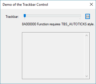
Let’s look at the above condition on tick marks by taking the script as written and selecting TrackbarSetTickFrequency from the menu:

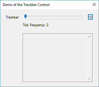
Notice the returned error about the style. After changing the style, the following will appear:

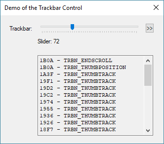
If we look at the notifications after sliding the slider, we’ll see:

As the slider is moves, the status area is updated with notifications printed in the message area.
Control Styles
Looking at the resource we’ll find the following:
TrackbarControl01Dlg DIALOGEX 0, 0, 220, 160
EXSTYLE WS_EX_DLGMODALFRAME
STYLE DS_3DLOOK | WS_POPUP | WS_VISIBLE | WS_CAPTION | WS_SYSMENU
CAPTION "Demo of the Trackbar Control"
FONT 8, "MS Shell Dlg"
{
 CONTROL "Trackbar:", -1, "static", WS_CHILD | WS_VISIBLE | WS_GROUP, 12, 12, 80, 12
 CONTROL "", TB_TRACKBAR, "msctls_trackbar32", TBS_ENABLESELRANGE| WS_TABSTOP | WS_CHILD | WS_VISIBLE | WS_GROUP, 50, 10, 140, 12
 //CONTROL "", TB_TRACKBAR, "msctls_trackbar32", TBS_AUTOTICKS | WS_TABSTOP | WS_CHILD | WS_VISIBLE | WS_GROUP, 50, 10, 140, 12
 //CONTROL "", TB_TRACKBAR, "msctls_trackbar32", WS_TABSTOP | WS_CHILD | WS_VISIBLE | WS_GROUP, 50, 10, 140, 12
 //CONTROL "", TB_TRACKBAR, "msctls_trackbar32", TBS_FIXEDLENGTH | WS_TABSTOP | WS_CHILD | WS_VISIBLE | WS_GROUP, 50, 10, 140, 12
 CONTROL ">>", TB_MENU, "button", BS_PUSHBUTTON | WS_TABSTOP | WS_CHILD | WS_VISIBLE | WS_GROUP, 195, 10, 12, 12
 CONTROL "Slider:", TB_NOTIFY_01, "static", SS_LEFT | WS_CHILD | WS_VISIBLE | WS_GROUP, 50, 28, 170, 20
 CONTROL "", TB_NOTIFY_02, "edit", ES_LEFT | ES_MULTILINE | ES_AUTOVSCROLL | ES_AUTOHSCROLL | ES_READONLY | ES_WANTRETURN | WS_VSCROLL | WS_CHILD | WS_VISIBLE | WS_BORDER | WS_TABSTOP, 50, 50, 156, 100, 0
}
The blue highlighted line shows the trackbar control. Note the rather complex class name. This is Microsoft’s internal name. Legato 1.1o or later will also support the shorthand define WC_TRACKBAR. As I said above, the commented lines are there for easy replacement to check various operational modes.
The styles that can be used and combined:
| Constant | Description | |||
|---|---|---|---|---|
| TBS_AUTOTICKS | The trackbar control has a tick mark for each increment in its range of values. The frequency of the ticks can be adjusted via the TrackbarSetTickFrequency function. | |||
| TBS_BOTH | The trackbar control displays tick marks on both sides of the control. This will be both top and bottom when used with TBS_HORZ or both left and right if used with TBS_VERT. | |||
| TBS_BOTTOM | The trackbar control displays tick marks below the control. This style is valid only with TBS_HORZ. | |||
| TBS_DOWNISLEFT | By default, the trackbar control uses down equal to right and up equal to left. Use the TBS_DOWNISLEFT style to reverse the default, making down equal left and up equal right. | |||
| TBS_ENABLESELRANGE | The trackbar control displays a selection range only. The tick marks at the starting and ending positions of a selection range are displayed as triangles (instead of vertical dashes), and the selection range is highlighted. | |||
| TBS_FIXEDLENGTH | The trackbar control allows the size of the slider to be changed with the TrackbarSetSliderSize function. | |||
| TBS_HORZ | The trackbar control is oriented horizontally. This is the default orientation. | |||
| TBS_LEFT | The trackbar control displays tick marks to the left of the control. This style is valid only with TBS_VERT. | |||
| TBS_NOTHUMB | The trackbar control does not display a slider. | |||
| TBS_NOTICKS | The trackbar control does not display any tick marks. | |||
| TBS_NOTIFYBEFOREMOVE | The trackbar control should notify its parent before repositioning the slider due to user action (this enables snapping). When present, the TRBN_THUMBPOSCHANGING message is sent via the action procedure. | |||
| TBS_REVERSED | This style bit is used for "reversed" trackbars, where a smaller number indicates "higher" and a larger number indicates "lower." It has no effect on the control’s function; it is simply a label that can be checked to determine whether a trackbar is normal or reversed. | |||
| TBS_RIGHT | The trackbar control displays tick marks to the right of the control. This style is valid only with TBS_VERT. | |||
| TBS_TOP | The trackbar control displays tick marks above the control. This style is valid only with TBS_HORZ. | |||
| TBS_TOOLTIPS | The trackbar control supports tooltips. When a trackbar control is created using this style, it automatically creates a default tooltip control that displays the slider's current position. You can change where the tooltips are displayed by using the TrackbarSetToolTipPosition function. | |||
| TBS_TRANSPARENTBKGND | The trackbar control’s background is painted by the parent. | |||
| TBS_VERT | The trackbar control is oriented vertically. The default is horizontal. |
Notifications
User actions result in standard notification via the “action” procedure. Note that for clarity, some of these messages have been renamed from the Windows SDK. These are:
| Define | Value | Description | ||||
| TRBN_THUMBPOSCHANGING | -2 | Notification that the thumb position on a trackbar is changing. This can also be processed by the “notify” procedure. | ||||
| TRBN_LINEUP | 0 | Scrolled a line increment. | ||||
| TRBN_LINELEFT | 0 | Scrolled a line increment. | ||||
| TRBN_LINEDOWN | 1 | Scrolled a line increment. | ||||
| TRBN_LINERIGHT | 1 | Scrolled a line increment. | ||||
| TRBN_PAGEUP | 2 | Scrolled a page increment. | ||||
| TRBN_PAGELEFT | 2 | Scrolled a page increment. | ||||
| TRBN_PAGEDOWN | 3 | Scrolled a page increment. | ||||
| TRBN_PAGERIGHT | 3 | Scrolled a page increment. | ||||
| TRBN_THUMBPOSITION | 4 | Thumb position has changed. This is sent at the end of a drag. | ||||
| TRBN_THUMBTRACK | 5 | Thumb position is changing. This is sent during a drag. | ||||
| TRBN_TOP | 6 | Moved to minimum value. | ||||
| TRBN_LEFT | 6 | Moved to minimum value. | ||||
| TRBN_BOTTOM | 7 | Moved to maximum value. | ||||
| TRBN_RIGHT | 7 | Moved to maximum value. | ||||
| TRBN_ENDSCROLL | 8 | The moving process has ended. If the keyboard is repeating, this is sent after the key is released. When dragging, it is sent along with the TRBN_THUMBPOSITION notification. |
Setting Up the Trackbar
Once a style has been selected, setting up the trackbar control is easy. There are two main concerns: setting the end points and setting the position. The trackbar control works on a logical range set by the programmer. This makes it easy to deal with ranging where the lowest value is not zero. For example, this would be useful in zooming from 50% to 400%. Use the TrackbarSetRange function to specify its range.
int = TrackbarSetRange ( int id, word low, word high );
The id parameter is the same here as for all controls defined by the CONTROL statement. The trackbar’s range itself is specified as two unsigned 16-bit values. If you use a logical range larger than 65,535, then you will have to employ a scaling scheme.
The whole number increments of the logical range set the granularity if the slider. Setting the slider’s position is performed by using the TrackbarSetSliderPosition function:
int = TrackbarSetSliderPosition ( int id, word position );
The position must be within the previously specified range.
The range can also be read:
int[] = TrackbarGetRange ( int id );
The returned int array contains the key names “min” and “max” for the two associated values.
Reading Position
At some point, to attach the trackbar control to some functionality, its position will need to be read:
int = TrackbarGetSliderPosition ( int id );
The return value will be within the logic range unless a formatted error code is returned. Generally, the slider position is read when a change is made to the control. We will discuss that below in the notifications section.
Adjusting Tick Marks
Tick marks provide a nice, visual queue for estimating position as the user moves the slider. There are two methods of creating tick marks: automatic and manual. In automatic, the style the TBS_AUTOTICKS is set in the resource definition and then the TrackbarSetTickFrequency function can be used to set the intervals:
int = TrackbarSetTickFrequency ( int id, int frequency );
The frequency sets the logical interval between tick marks. The default is 1 when the control is created. Depending on the logical range, this can result in extremely tight tick spacing. The frequency simply tells the control to skip a certain number of positions before drawing another tick mark. The example code demonstrates setting the tick marks by incrementally changing the frequency each time the menu selection is run.
To achieve a snapping action, scale your logical range. For example, let’s go back to our zoom example. Suppose we want a range of 50% to 400% but in increments of 10%. Set the logical range from 5 to 40:

With auto ticks, the spacing is at a reasonable and the slider snaps every 10%.
Ticks can be sent manually using the function:
int = TrackbarSetTickMark ( int id, int position );
Each mark is manually set using the position parameter which should be within the logical range.

This is also a menu option in the demonstration code. Note that the slider can move between the ticks since we did not worry about scaling the logical positions.
By default, the control always has a starting and ending tick mark, so setting those values is not necessary.
Finally, there are functions to read the tick marks in logical positions and in physical pixel positions:
int = TrackbarGetTickCount ( int id );
int[] = TrackbarGetTickMarks ( int id );
int = TrackbarGetTickPosition ( int id, int index );
The last item allows the internal drawing position to be read by index for each tick position.
Finally, all the logical ticks can be cleared with the TrackbarClearTicks function.
Using a Select Area
Sometimes it is nice to highlight a particular area or show a select range:
int = TrackbarSetSelectRange ( int id, word start, word end );
In order to use this feature, the TBS_ENABLESELRANGE style must be set. In addition, for a selection to appear, the function must be run.

Note that the select range does not constrain the slider.
The range can also be cleared or read:
int = TrackbarClearSelect ( int id );
int[] = TrackbarGetSelectRange ( int id );
The operation of the TrackbarClearSelect function is obvious. When getting the select positions, the returned int array contains the key names “start” and “end” for the two associated values.
Keyboard and Mouse
Mouse operation seems pretty obvious, but we will cover notifications in the next section. Keyboard operation, on the other hand, requires a little explaining. If the control has focus, the Arrows, Page Up/Down, Home and End keys will move the slider. The distance the slider moves is dependent on the line and page size. By default, the line size is 1 logical unit and the page size 1/5th the difference from the min and max logical positions. To change these values, the following functions are provided:
int = TrackbarSetLineSize ( int id, int size );
int = TrackbarSetPageSize ( int id, int size );
The values can be read as well:
int = TrackbarGetLineSize ( int id );
int = TrackbarGetPageSize ( int id );
The Home and End key notifications are treated like arrows but take the slider to the min or max positions, respectively.
Interpreting Notifications
As noted above, there are a number of notifications generated by user gestures that the trackbar control will send via the action procedure. These can be seen in the demo program as the slider is moved.
When the slider is moved via the keyboard, a line or page notification will be sent followed by an TRBN_ENDSCROLL message. The line can be left (TRBN_LINELEFT), right (TRBN_LINERIGHT), up (TRBN_LINEUP), or down (TRBN_LINEDOWN). Left/up and right/down are actually the same underlying notification value. Depending on the visual orientation of the control, the script code can be made clearer by using the appropriate directional term.
When the slider is dragged by the mouse, each position change will send a TRBN_THUMBTRACK notification for each movement, and, when the user lets go, a TRBN_THUMBPOSITION notification is added. Lastly the TRBN_ENDSCROLL message is sent. Note the TRBN_ENDSCROLL notification is common to the keyboard and mouse and is therefore a good notification to capture to change an associated control.
As a side note, it is possible to constrain the movement of the slider by reading its position and then resetting it if it’s outside of a arbitrary range, such as the visual select area.
Miscellaneous Items
When the trackbar control was added to the Legato API, we exposed all the functionality of the Windows SDK. As a result, there are provisions for “buddy” and “tip” windows, as well as drawing positions for various parts of the trackbar. At this point, there is no support for drawing, and while the trackbar tip window can be set, an associated tip window control has not been exposed within the API. You can play around with the functions and try to attach windows. Each of the functions is documented in the Legato SDK.
Conclusion
If you have worked with scrollbars, you can see a marked similarity between the scrollbar control and the trackbar control. They even share may of the same notification values. The benefit of the trackbar is a combination of its appearance and its additional features, such as tick marks and select ranges.
A trackbar is a useful tool for certain applications and is certainly nice to have available. A potential application would be to add a zoom control to a page control for rendering HTML or may be running through a series of options displayed in an associated edit control. It’s a neat way to let a user fluidly interact with a large range of items or settings.
 Scott Theis is the President of Novaworks and the principal developer of the Legato scripting language. He has extensive expertise with EDGAR, HTML, XBRL, and other programming languages. Scott Theis is the President of Novaworks and the principal developer of the Legato scripting language. He has extensive expertise with EDGAR, HTML, XBRL, and other programming languages. |
Additional Resources
Legato Script Developers LinkedIn Group
Primer: An Introduction to Legato
Quicksearch
Categories
Calendar

|
May '26 |
|
||||
|---|---|---|---|---|---|---|
| Mo | Tu | We | Th | Fr | Sa | Su |
| Monday, May 04. 2026 | ||||||
| 1 | 2 | 3 | ||||
| 4 | 5 | 6 | 7 | 8 | 9 | 10 |
| 11 | 12 | 13 | 14 | 15 | 16 | 17 |
| 18 | 19 | 20 | 21 | 22 | 23 | 24 |
| 25 | 26 | 27 | 28 | 29 | 30 | 31 |

